

“Minimum viable” is a useful concept in the world of startups and early-stage companies. A minimum viable product isn’t a careless version — it’s the smallest, first useful version of something that still demonstrates value, earns belief, and creates learning.
But where teams tend to misapply the concept is their website.
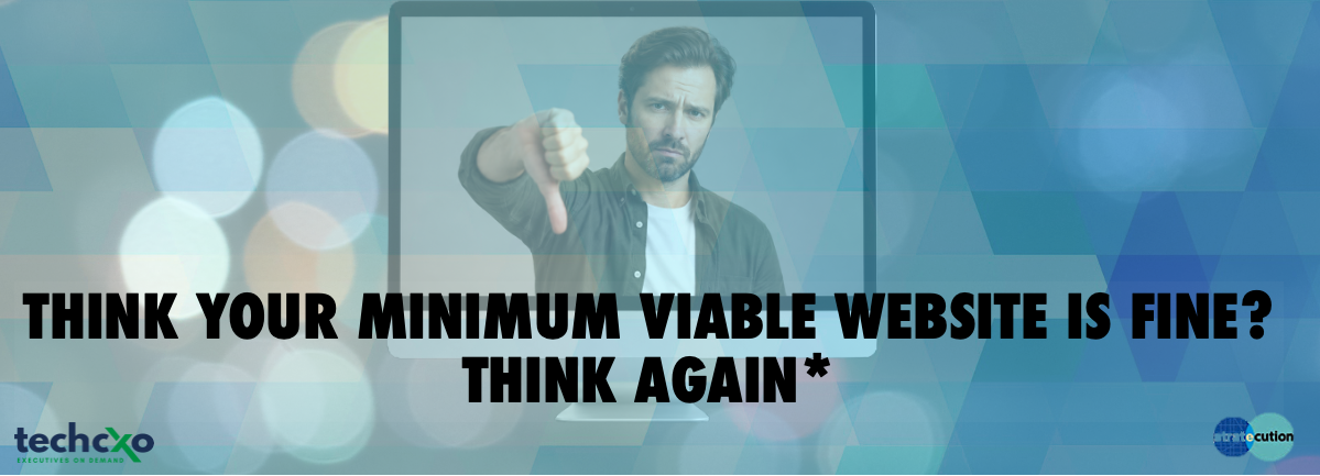
Many early-stage and growth companies assume they have a “minimum viable website” when what they really have is a too-low-value placeholder: a few pages and some generic copy, just enough to feel they’ve checked the box. The website exists, but it doesn’t achieve the minimum of what a website needs to do for them—help the right buyer quickly understand what you do and decide whether you’re trustworthy enough to do it for them.
When the quality of their website is brought up, company’s responses tend to be familiar: “We’ll fix it when we have time,” “Most deals come from relationships anyway,” and “We just need something up for now.”
And I get it. When you’re consumed with driving sales, optimizing product, and serving current clients, it’s easy to see how a website can become just another box to check.
But the “minimum viable website” mindset too often doesn’t actually achieve minimum viability. And this costs companies more than they realize.
The buying journey evolved—and it ain’t going back
For well over a decade, research and firsthand experience have reinforced the same important transformation: Buyers want to self-serve more of the journey before any sales conversation. In this environment, your website has to do more of the persuading before you ever have a chance to pitch your deck.
Most leaders know this in the abstract, but many still behave as if their website is secondary. In reality, it’s often the first serious evaluation touchpoint. And if it doesn’t help the right buyer understand what you do and believe you’re credible, they move on.
Your website’s job: create understanding and belief
A strong early-stage website doesn’t need dozens of pages. But it does need to do two things quickly and ably:
- Clarify your value: Who are you for, what problem do you solve, and what outcome do you enable?”
- Build belief: Do you understand my world? Is this professional, credible, believable? Is it worth my time and interest?
When the site is thin, vague, or seemingly tossed together, it doesn’t just miss conversions. It creates drag that shows up everywhere else: leads pause, referrals underperform, and marketing and sales efforts start colder. Buyers who seemed interested go quiet. Sales cycles take longer.
What “under-minimum” looks like
You can usually spot it immediately:
- The homepage headline is about your company, not the buyer. It focuses on product features (“AI-powered,” “end-to-end”) and self-congratulation (“First ever,” “Best in class”) instead of customer value.
- It’s unclear who it’s for. Rather than being specific, you list multiple types of customers. And if you could be for everyone, you’re not perfect for anyone.
- The language is internal. Rather than showing understanding of the buyer’s context and needs, the language is about us and our product, company, and what we do.
- It underplays other important credibility drivers. Buyers look for clues that help them get over the natural skepticism they bring to vendor selection. That’s why elements like testimonials, case studies, and clear evidence of category expertise are so important.
- It looks like it was thrown together. A website for an early-stage company should help make it look more established than it is.
Design isn’t decoration, it’s part of the proof
This doesn’t mean you need to spend a fortune on a website. But it does mean you need to stop thinking of design as a cosmetic layer.
Research shows that buyers use design as a proxy for professionalism and quality, whether they realize it or not. Clean structure, thoughtful layout, strong typography, consistency, and clarity all send the same signal: This company is serious, capable, and worth paying attention to.
What a real minimum viable website should do
You can create a site that achieves minimum viability without a massive engagement if you focus on a few fundamentals:
- Lead with the buyer and the outcome. Put the problem you solve and the value you create front and center in the headline of your site — and ensure it’s echoed throughout the remaining pages.
- Be specific about whom it’s for. Name the audience clearly, speak in their language, be clear about their context. Precision builds relevance.
- Earn trust with real proof. Use examples, customer language, outcomes, scenarios, and credibility markers instead of abstract claims.
- Be honest about how your site looks, reads and feels.Make sure you project an impression of professionalism, intentionality, and precision — and not a sense of thrown together to “get our site up.”
It’s time to stop treating the website as a placeholder or something you will get to later — and start treating it as the front door of trust.
Because for many buyers, it is what they will engage with to decide whether or not they’ll spend any time with you at all.
*Originally published in MediaPost March 17, 2026
